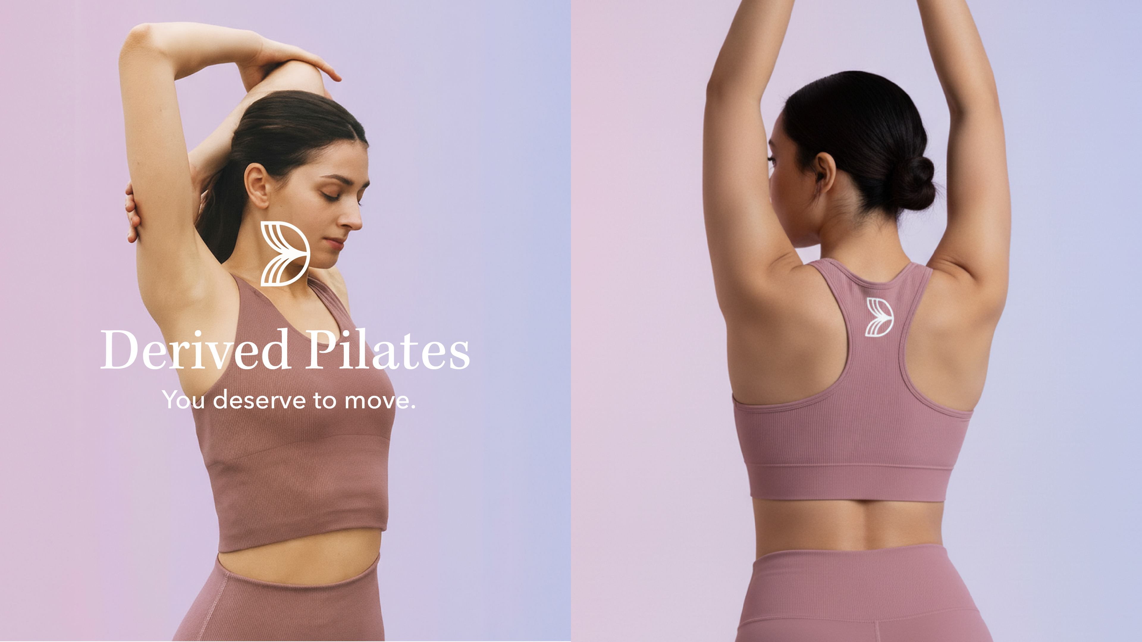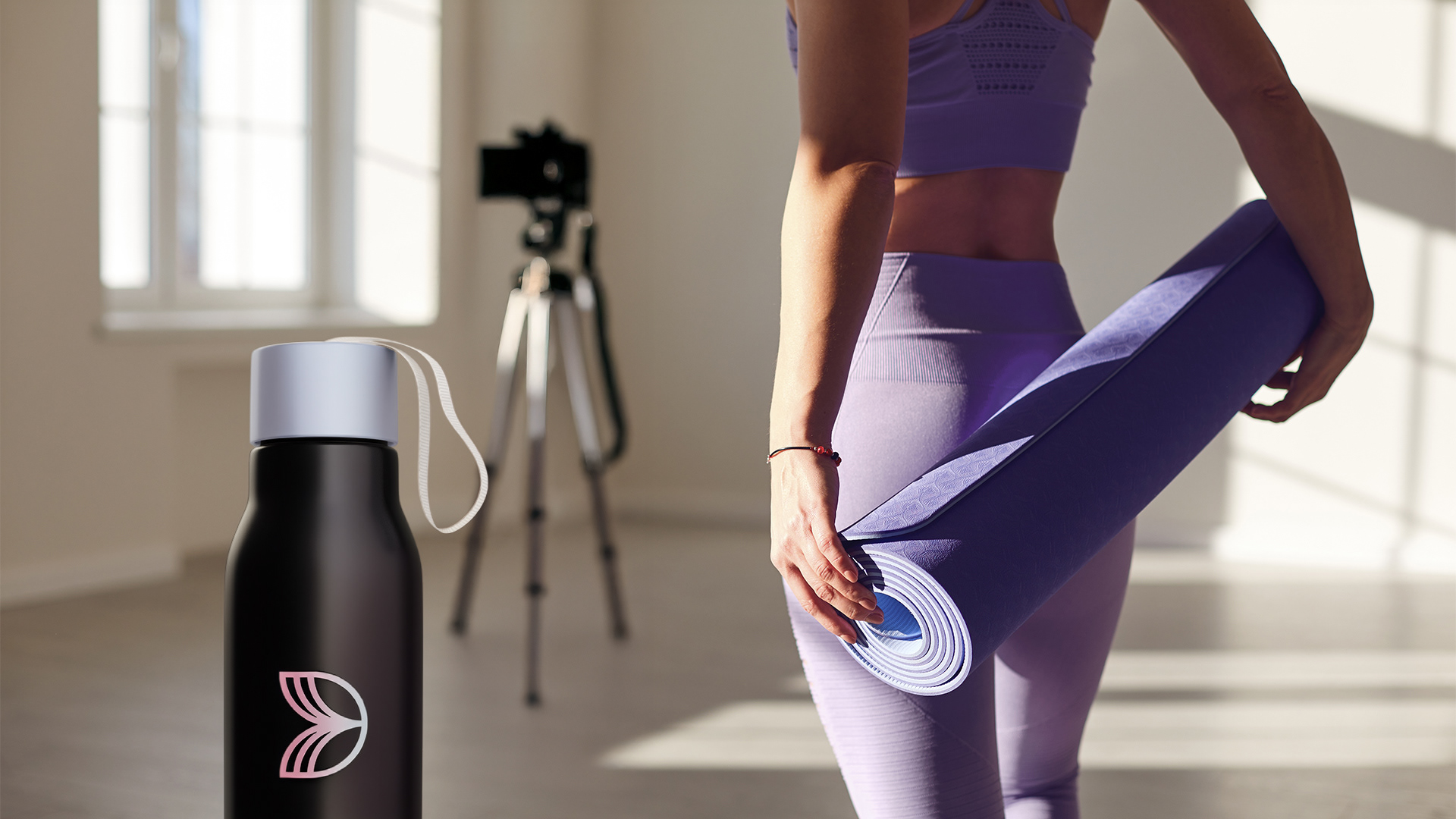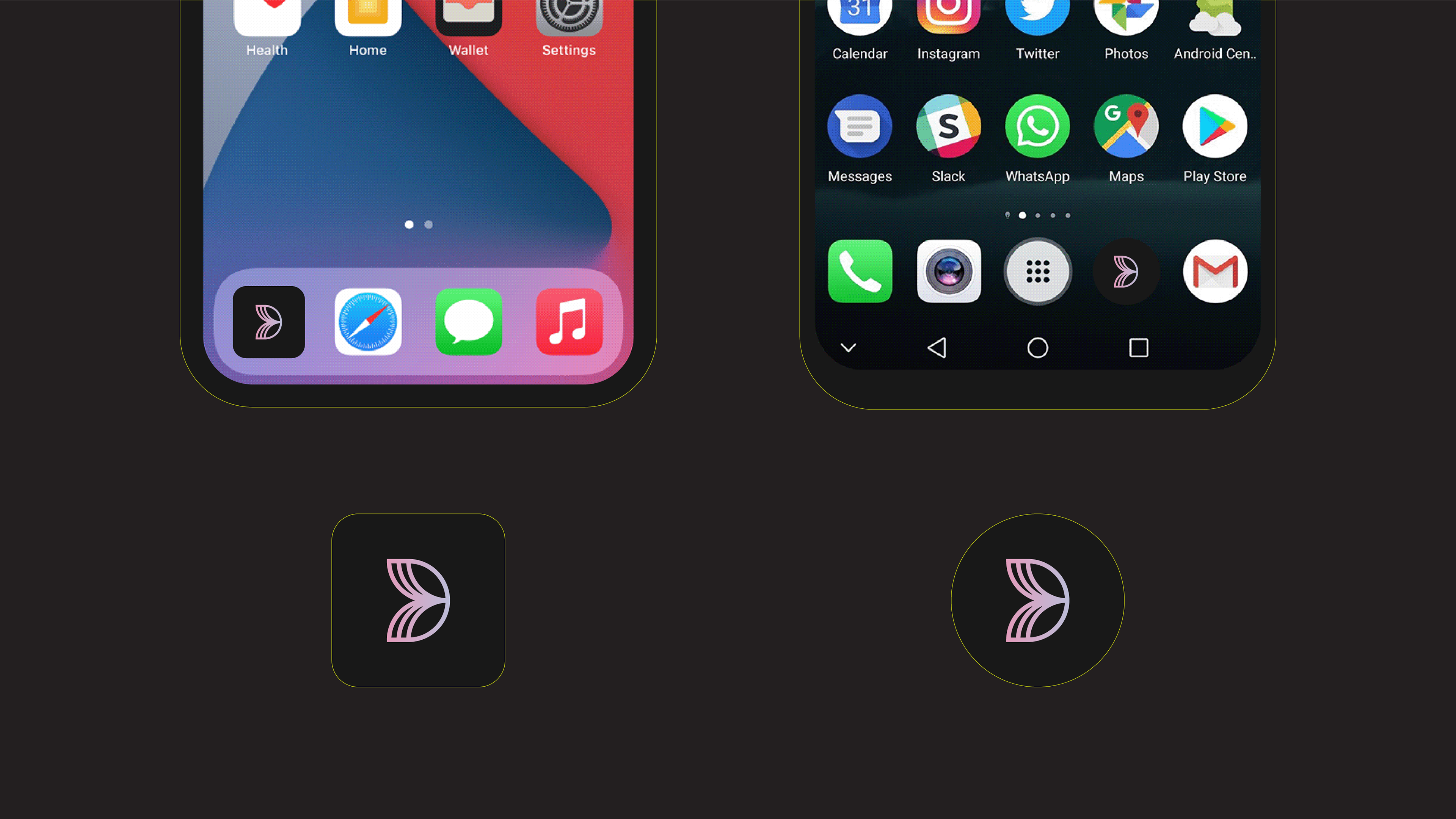
Derived Pilates asked me to redesign their outdated logo to appeal to a modern fitness audience. The cursive font was difficult to read, and the lotus flower design was overused and often appeared in auto-generated logos online. For an emerging brand, we couldn't afford for Derived Pilates to be mistaken or overlooked. To refresh the logo, I added lotus petals to the letter "D" and introduced directional elements to emphasize the dynamic movement of Pilates. The new logo is paired with a sans-serif font and perfectly applies across various mediums and sizes.
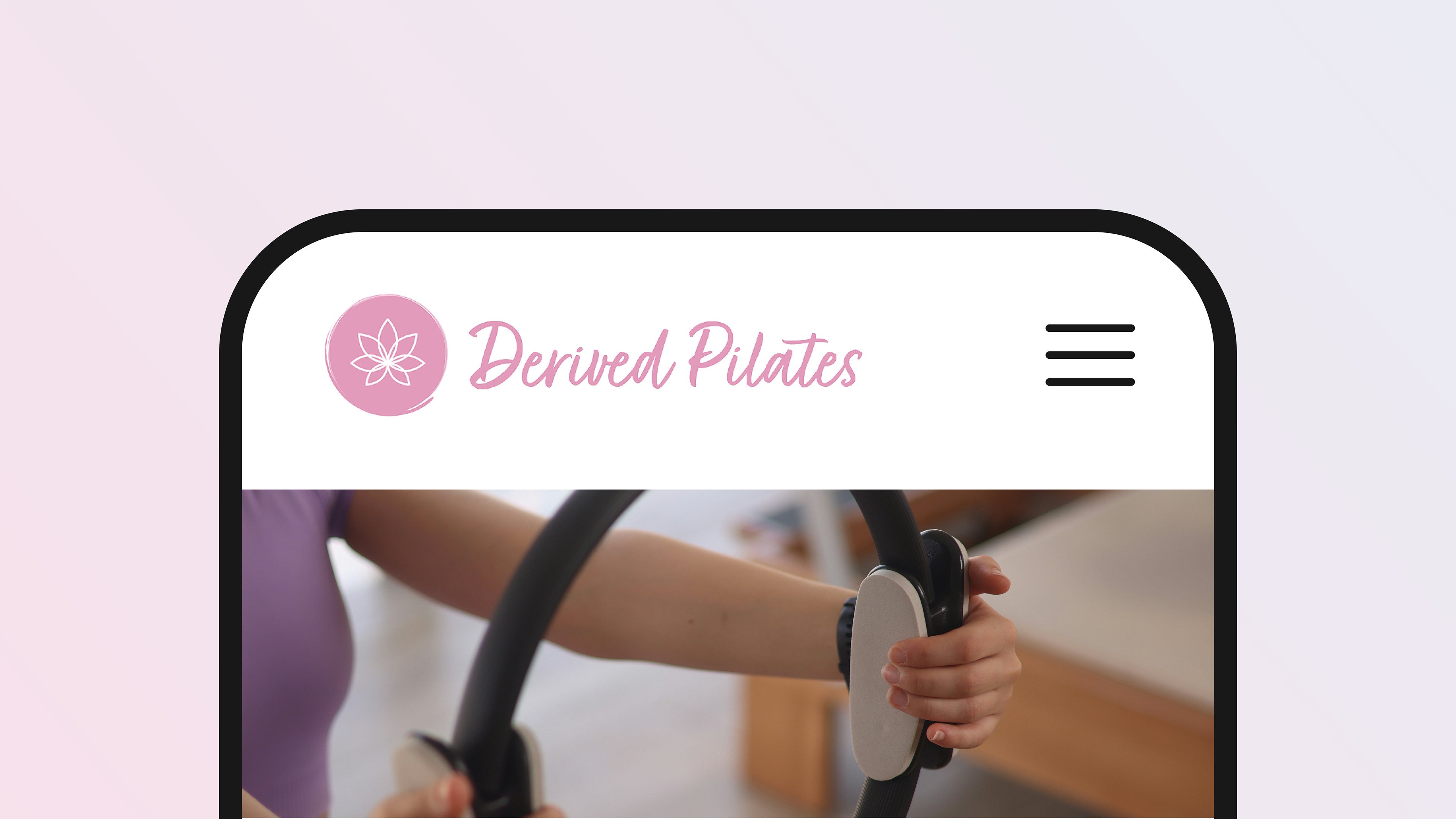
Old Derived Pilates logo
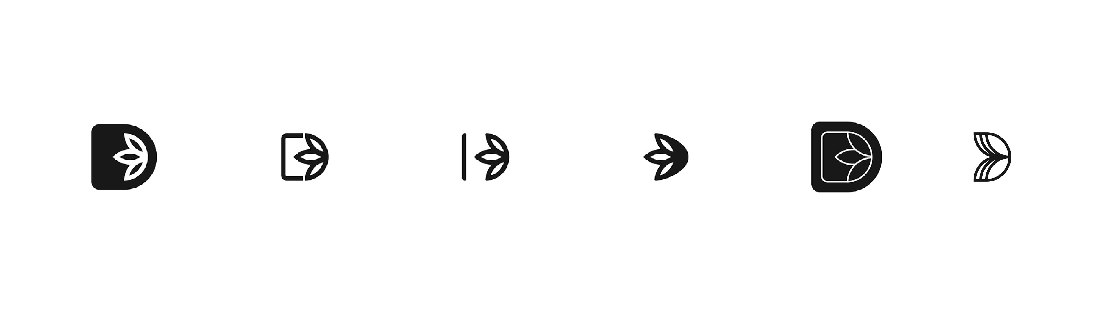
Design exploration