Website design for a fine art photographer, created to showcase her portfolio, published work, and brand in a clean, image-led experience.
Project Type: Website Design
Role: Web Design, Visual Design, Development
Scope: Homepage, Portfolio, About, Press, Contact, Mobile Optimization
Overview
Jen Fariello is a Charlottesville-based fine art photographer with 30 years of experience specializing in weddings, portraiture, and fine art photography. Known for her timeless, elegant style, her work has been featured in leading art and fashion publications.
The Assignment
Jen needed a website that could serve as a polished digital portfolio for her photography while making it easy for visitors to explore her work, learn more about her, and view her published features. The goal was to create a clean, elegant experience that let the imagery lead.
My Role
I led the design and development of Jen Fariello’s website through Afton Design Co., creating a refined digital portfolio that balanced visual impact with usability. Designed in Adobe XD and built on Showit, the site was structured to highlight Jen’s photography while supporting key brand and portfolio content in a clear, intuitive way.
Approach
To create a site that felt as refined as Jen’s work, I focused on restraint, structure, and clarity. The goal was to build a digital portfolio that let the photography lead while still giving the content a clear, consistent framework across desktop and mobile.
Create Space for the Imagery
I kept the layouts minimal and intentionally restrained so the photography could remain the focal point rather than compete with heavy interface elements.
I kept the layouts minimal and intentionally restrained so the photography could remain the focal point rather than compete with heavy interface elements.
Build a Clear Visual Framework
I used grid, typography, and CTA systems to give the site consistency and structure, making it easier to present a large body of work in a way that still felt polished and calm.
I used grid, typography, and CTA systems to give the site consistency and structure, making it easier to present a large body of work in a way that still felt polished and calm.
Keep the Experience Intuitive
From the start, I considered how the portfolio would translate to mobile so the site would feel just as elegant and easy to navigate on smaller screens.
From the start, I considered how the portfolio would translate to mobile so the site would feel just as elegant and easy to navigate on smaller screens.
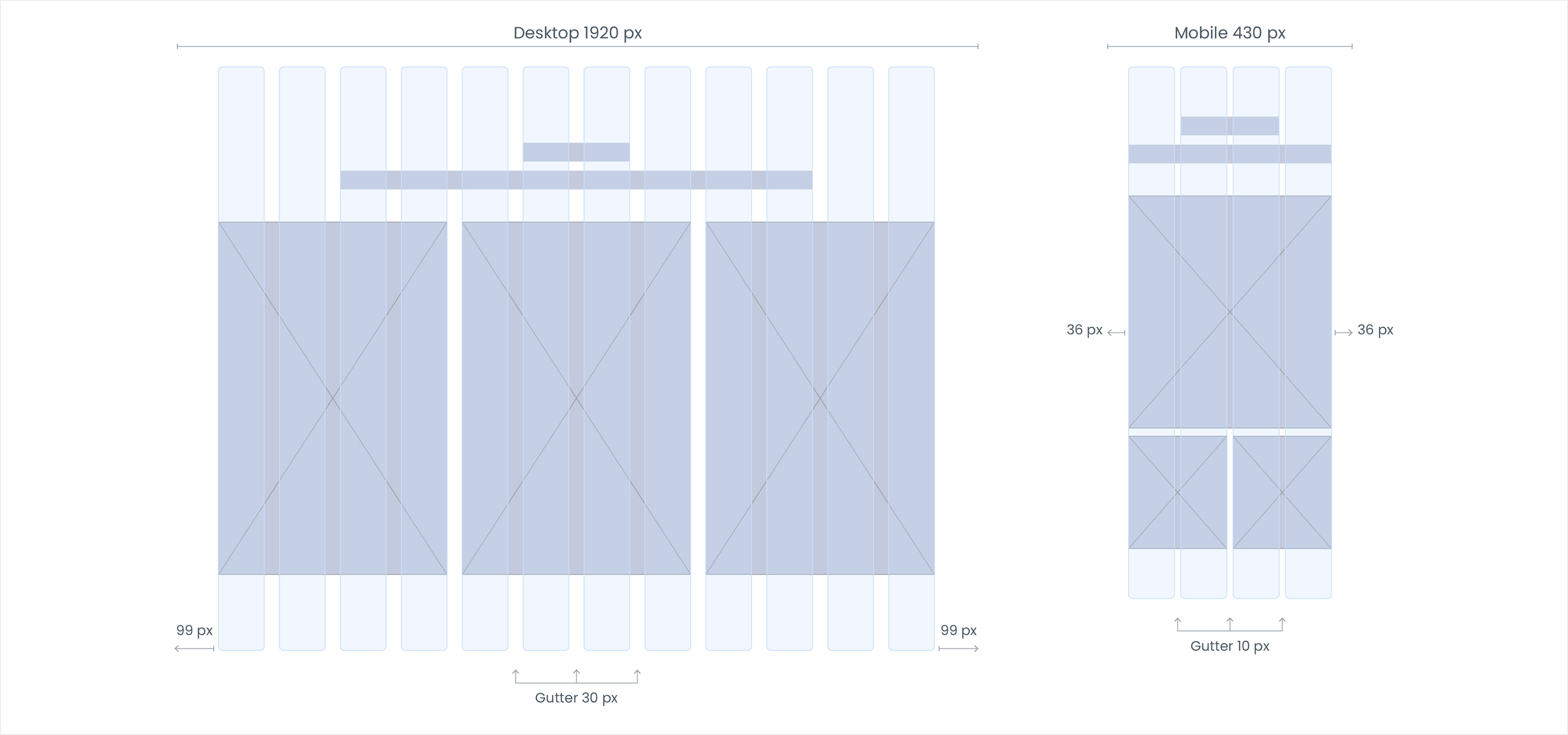
Grid System
A structured grid system created a consistent framework for the site, helping each page feel clean, balanced, and easy to navigate while giving the imagery room to lead.
Typography System
An elegant serif paired with a clean sans serif created a type system that feels timeless, airy, and easy to move through. The contrast helped establish hierarchy while keeping the overall experience soft and understated.
An elegant serif paired with a clean sans serif created a type system that feels timeless, airy, and easy to move through. The contrast helped establish hierarchy while keeping the overall experience soft and understated.
CTA System
Buttons and links were designed to feel refined and unobtrusive, giving the site a clear interaction pattern without competing with the imagery. The system balances polish and usability through simple, consistent treatments.
Buttons and links were designed to feel refined and unobtrusive, giving the site a clear interaction pattern without competing with the imagery. The system balances polish and usability through simple, consistent treatments.
Color Palette
A restrained palette of soft neutrals, muted blue-grays, and deep contrast tones helped shape the site’s calm, editorial feel. The colors support the photography rather than overpower it, reinforcing a sense of softness, elegance, and space.
A restrained palette of soft neutrals, muted blue-grays, and deep contrast tones helped shape the site’s calm, editorial feel. The colors support the photography rather than overpower it, reinforcing a sense of softness, elegance, and space.
Selected Screens
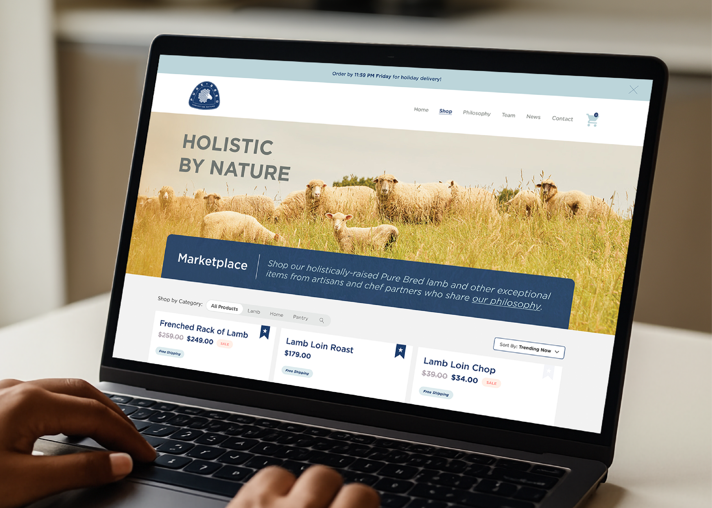
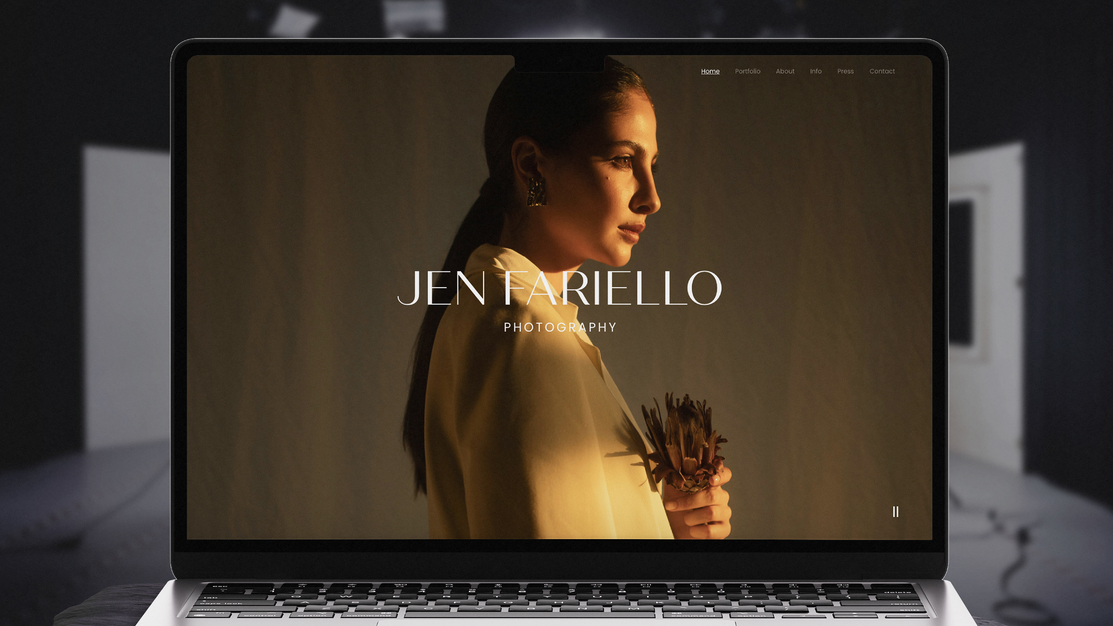
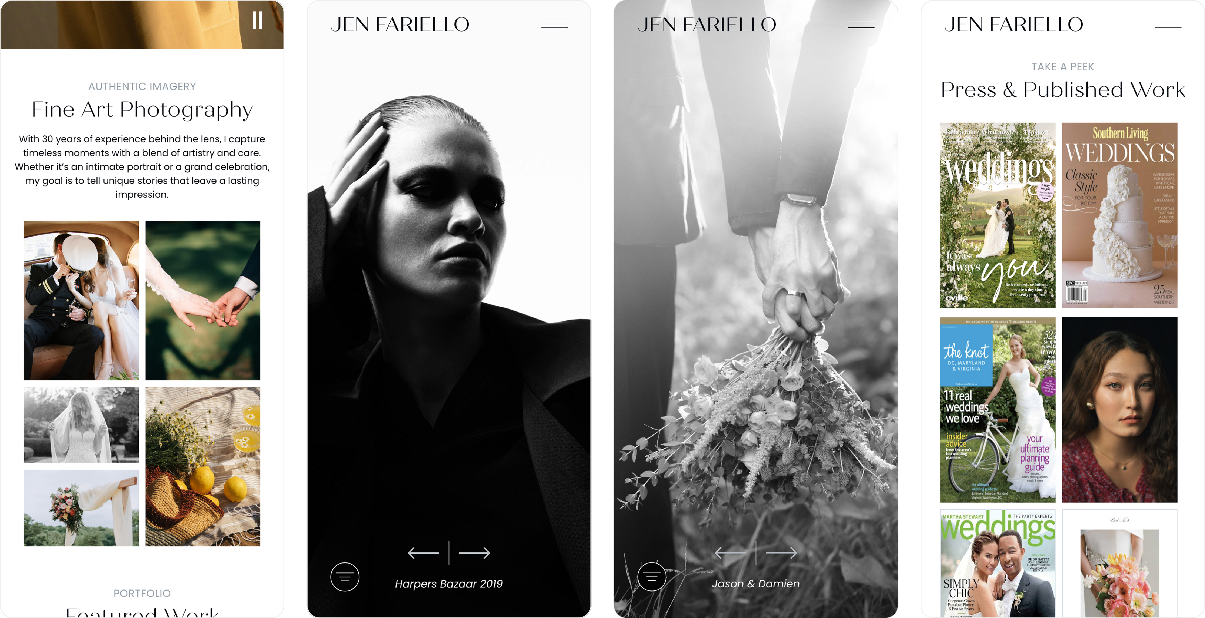
Homepage
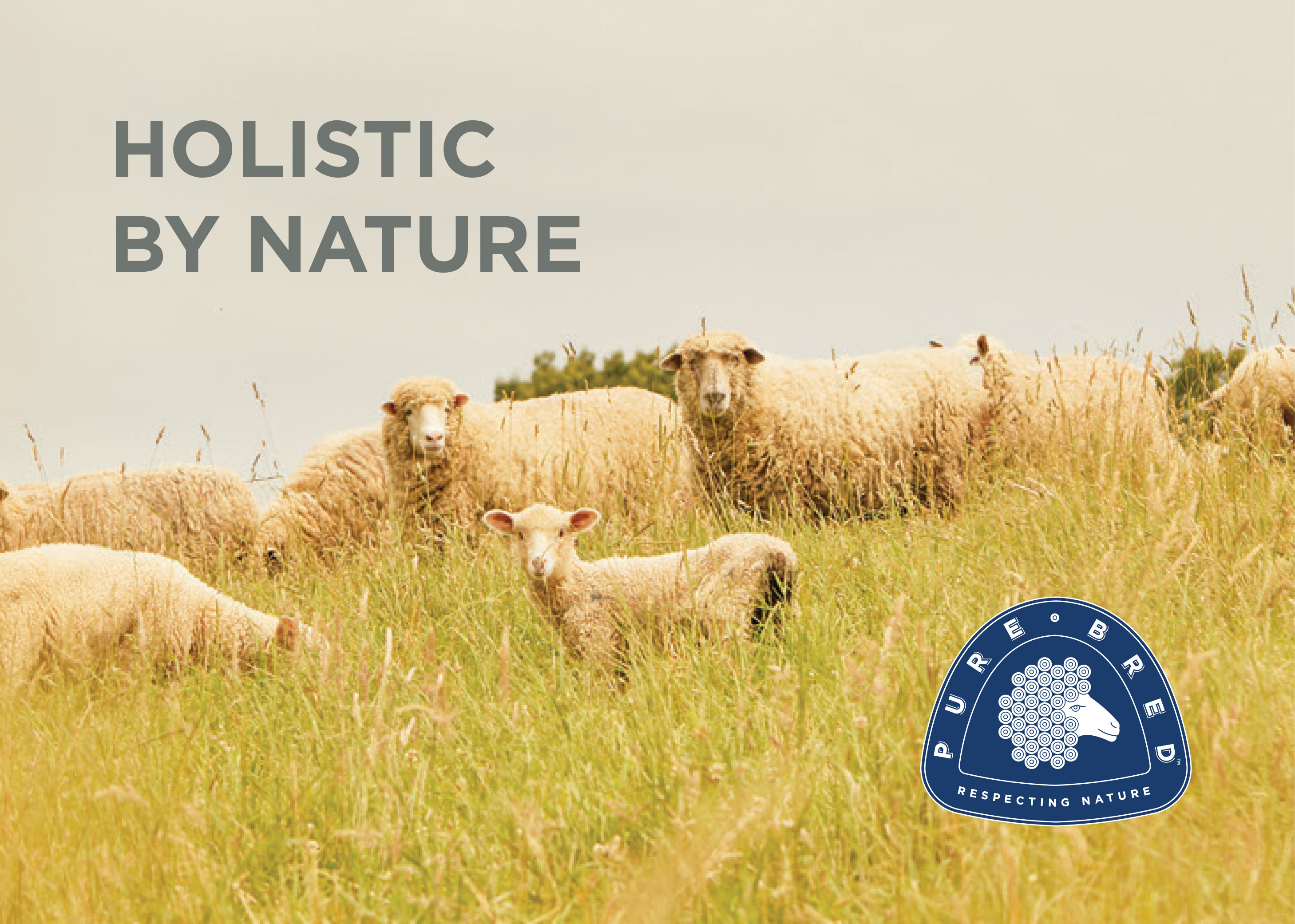
A clean, image-led homepage designed to introduce Jen’s work and aesthetic with immediate visual impact.
Portfolio
The portfolio page features a full-screen hero section that fills the viewport, showcasing Jen's range of work while keeping the navigation simple and unobtrusive.
Press & Published Work
A dedicated space for published work helped reinforce Jen’s credibility and give visitors a fuller view of her career.
Mobile Experience
The mobile layouts were designed to preserve the elegance of the desktop experience while keeping navigation and imagery easy to engage with on smaller screens.
Key Design Decisions
Image-First
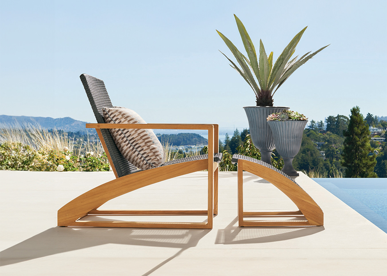
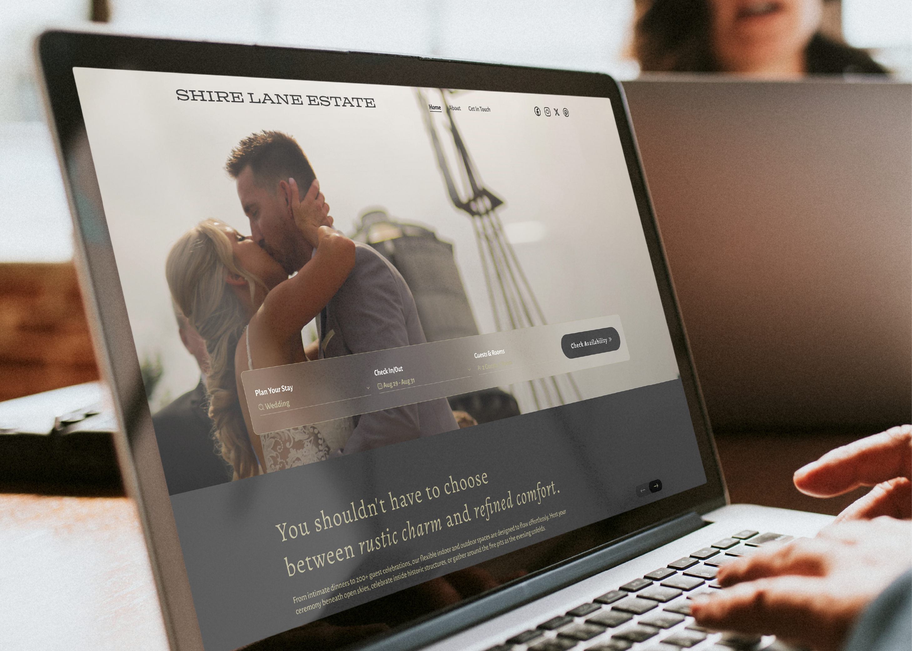
The layout and components were intentionally restrained so the work could shine. No need to zoom or click for details because Jen's photography takes center stage and fills the viewport at every opportunity. A muted color palette adds to the spacious, beathy feel of the website.
Clean Structure
The website needed to house different kinds of content: galleries, imagery, storytelling, publications, services, info, and inquiry forms. Organization was key. A strong foundational layout system allowed for generous spacing and created an editorial home with simple navigation and intuitive browsing.
Outcome
The final website gave Jen Fariello a refined digital portfolio that feels aligned with her work and reputation. It created a more polished online presence while making it easy for visitors to explore her imagery, learn more about her, and view her published features.