Shopping experience optimization for a premium lamb brand, focused on modernizing an outdated e-commerce flow, improving product discovery, and streamlining the path to purchase across desktop and mobile.
Project Type: E-commerce Redesign
Role: Web Design, Visual Design, Art Direction
Scope: Shop page, Category page templates, Product page, Mobile Optimization
Overview
Pure Bred is a premium lamb brand rooted in transparency, animal welfare, and environmental responsibility. Partnered with Elysian Fields Farms and Chef Thomas Keller, the brand connects consumers to farmers through a shared philosophy of quality and care.
This project focused on redesigning Pure Bred’s e-commerce experience to create a more modern, user-friendly platform that could better support online sales. With limited direct-to-consumer infrastructure in place, the goals was to create a clean, user-friendly shopping experience optimized for both desktop and mobile.
The Assignment
Pure Bred’s existing website needed a modern e-commerce platform that made online shopping feel clearer, easier, and more seamless. The previous experience had limited functionality and created friction throughout the buying process. In the wake of COVID-19, Pure Bred faced major disruptions to its B2B business, making it critical to open a direct sales channel for consumers.
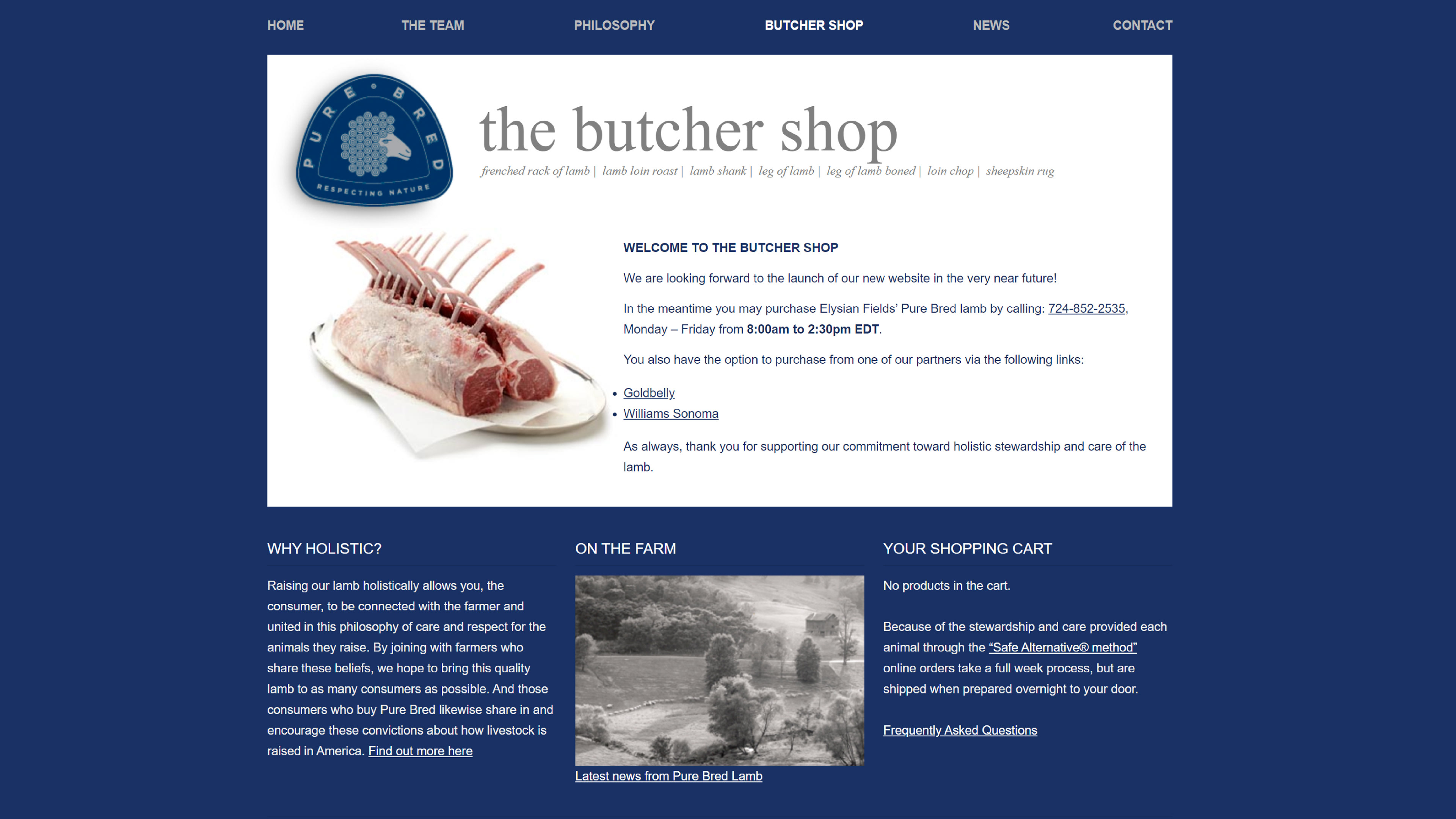
Pure Bred's old Shop page
My Role
I redesigned the online shopping experience for Pure Bred, focusing on structure, usability, and visual clarity across desktop and mobile. My work centered on creating a more polished storefront, simplifying the product browsing experience with templated shopping categories, refining individual product pages, and improving the add-to-cart flow to support a smoother path to purchase.
Approach
Streamline the Path to Purchase
The existing site made shopping unnecessarily difficult, with navigation buried in text and key actions hard to find. I focused on creating a clearer, more direct shopping flow with fewer steps between landing on the site and placing an order.
The existing site made shopping unnecessarily difficult, with navigation buried in text and key actions hard to find. I focused on creating a clearer, more direct shopping flow with fewer steps between landing on the site and placing an order.
Balance Brand Storytelling with Usability
Pure Bred’s brand mattered. People were not just buying lamb, they were buying into the quality, philosophy, and identity behind it. I wanted the shopping experience to feel more intuitive and product-focused, while still carrying enough of the brand story to preserve what made it feel premium and distinct.
Pure Bred’s brand mattered. People were not just buying lamb, they were buying into the quality, philosophy, and identity behind it. I wanted the shopping experience to feel more intuitive and product-focused, while still carrying enough of the brand story to preserve what made it feel premium and distinct.
Design for Clarity Across Screens
The site needed to work across both desktop and mobile, especially since the original experience was nearly unusable on smaller screens. From the start, I approached mobile as a priority, making sure the shopping flow felt easy and usable at every step.
The site needed to work across both desktop and mobile, especially since the original experience was nearly unusable on smaller screens. From the start, I approached mobile as a priority, making sure the shopping flow felt easy and usable at every step.
Selected Screens
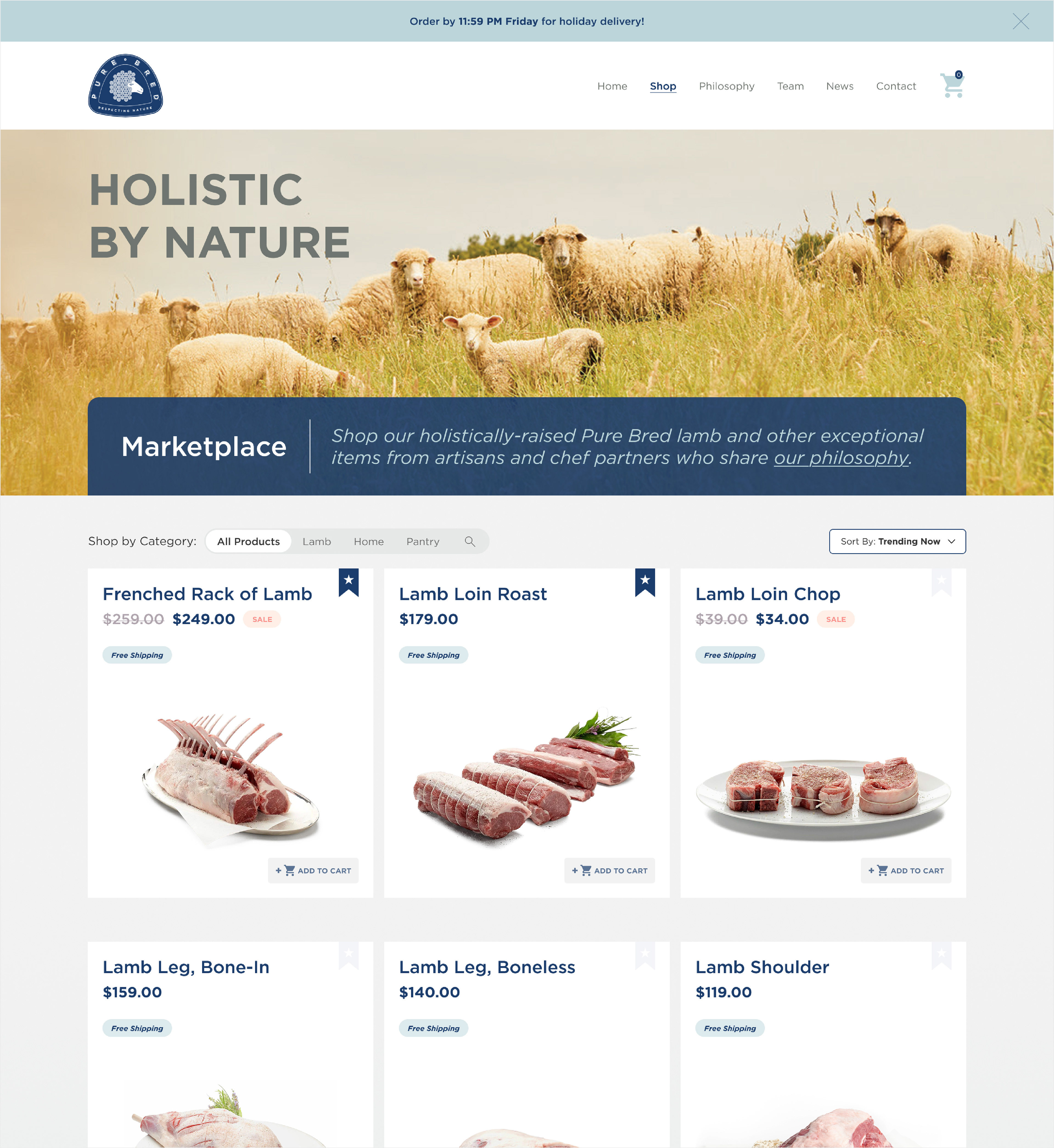
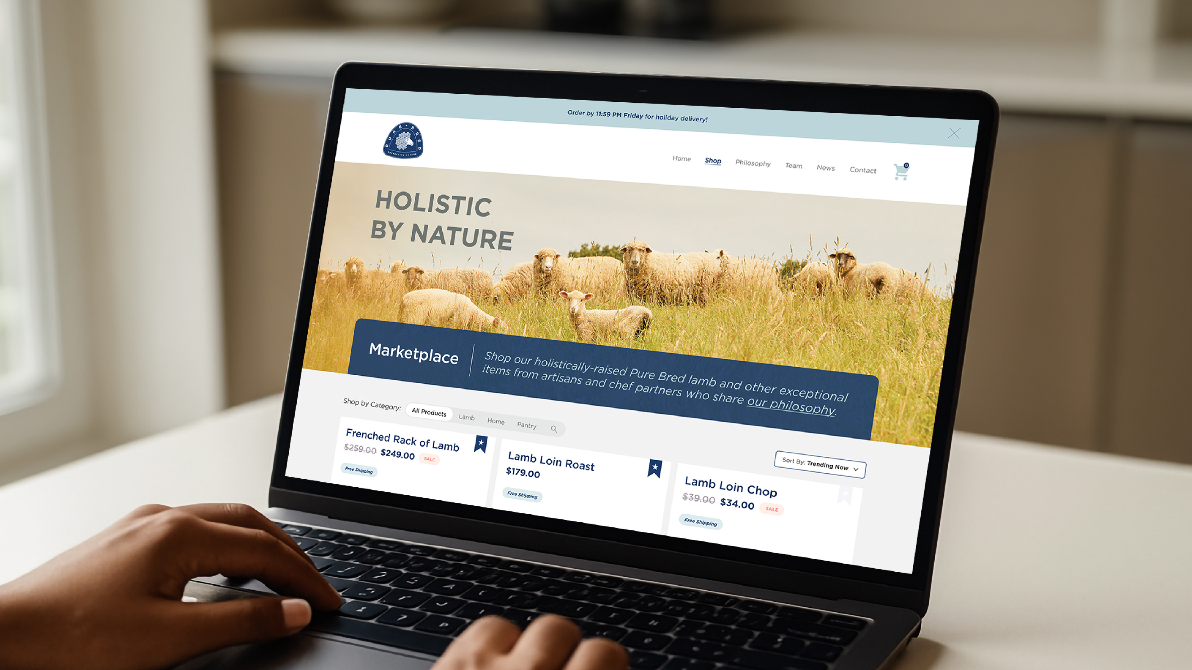
Shop page
A redesigned shop page built to make product discovery feel more streamlined, visual, and easy to navigate.
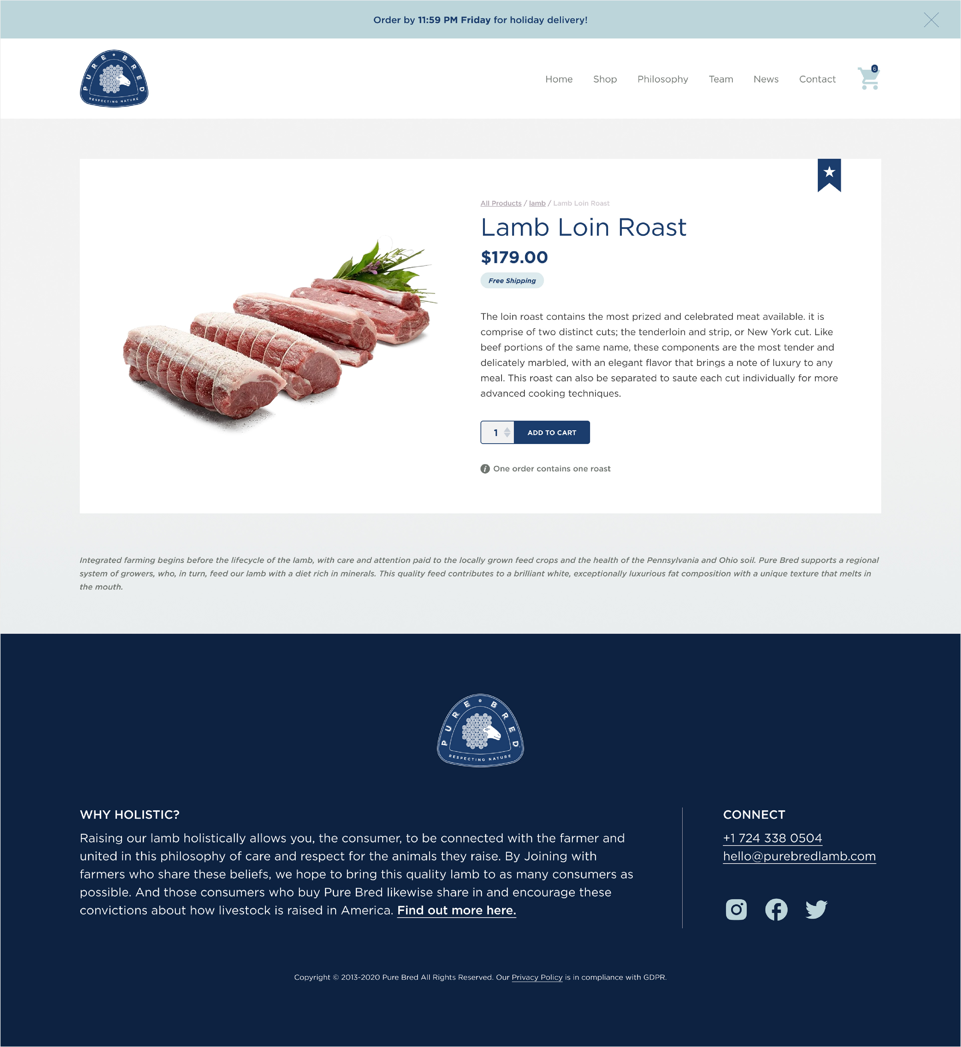
Product Detail page
The product page was refined to better balance imagery, key details, and purchase actions in a cleaner, more structured layout.
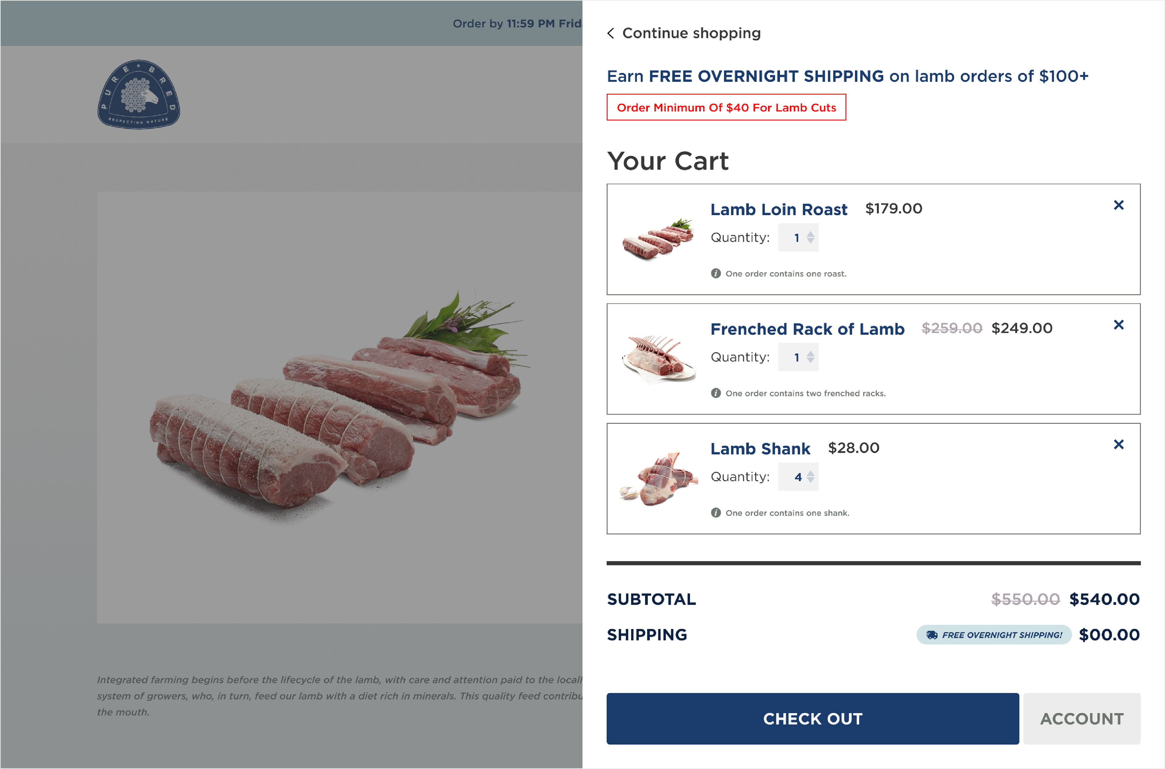
Shopping Cart drawer
The cart experience was simplified to make order review feel clearer and more actionable before checkout.
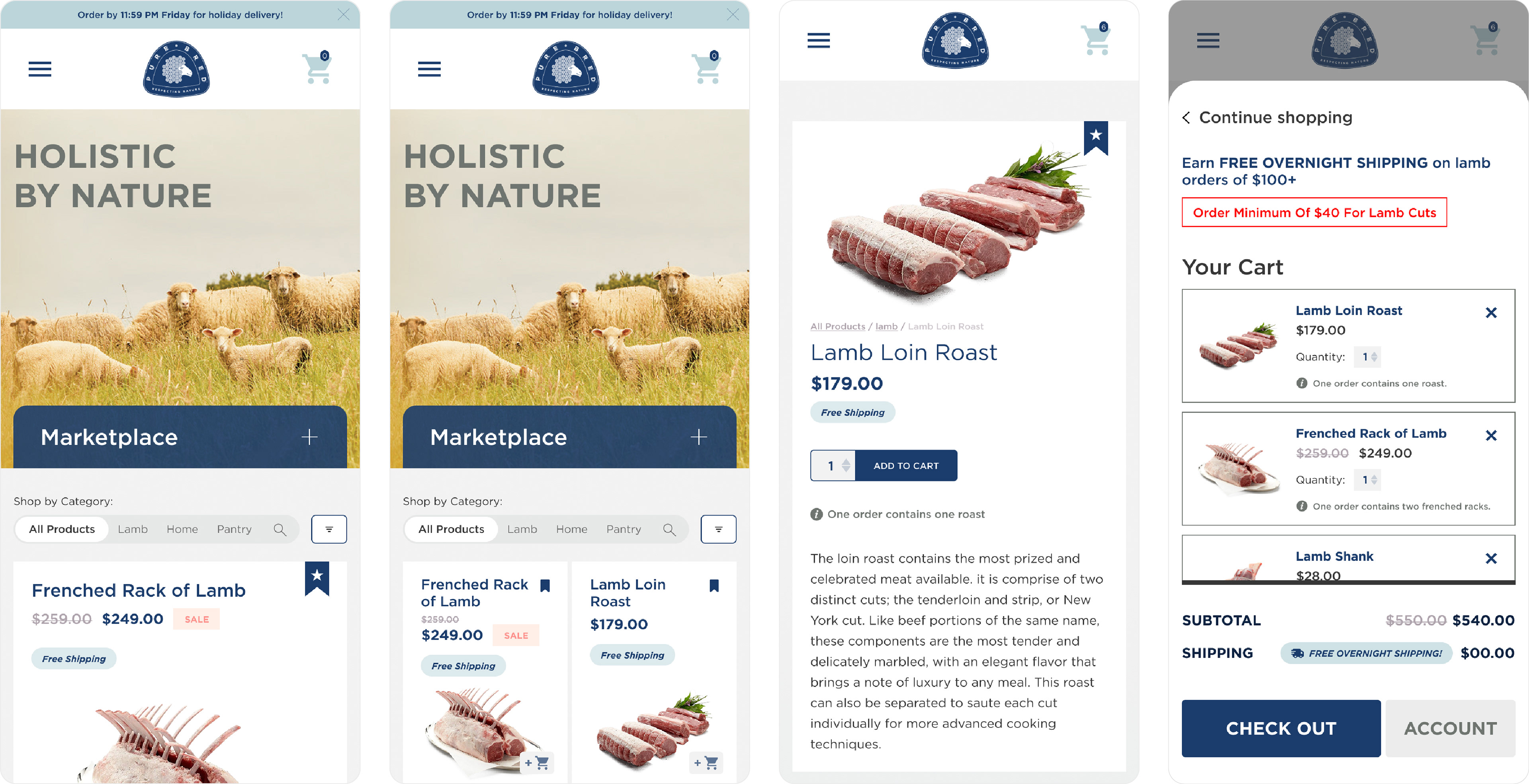
Mobile experience
The mobile shopping experience was designed to feel just as clear and intuitive, with layouts optimized for smaller screens and a smoother path to purchase.
L-R: Shop page 1-column view, Shop page 2-column view, Product Detail page, Shopping Cart drawer
Key Design Decisions
Easy Filtering and Navigation
I introduced a clearer shopping structure with dedicated categories, filters, and search so customers could move more easily between product types and find what they needed faster. On mobile, I also included both 1- and 2-column views to give customers a more flexible browsing experience.
I introduced a clearer shopping structure with dedicated categories, filters, and search so customers could move more easily between product types and find what they needed faster. On mobile, I also included both 1- and 2-column views to give customers a more flexible browsing experience.
Reduce Friction Throughout the Buying Process
Quick add buttons on product cards made it easier to shop without clicking into every product, while a cart drawer gave customers fast, consistent access to their order without interrupting the flow. I also added modern e-commerce features like wishlists, customer accounts, and order history so customers could save products, revisit past orders, and track deliveries more easily.
Quick add buttons on product cards made it easier to shop without clicking into every product, while a cart drawer gave customers fast, consistent access to their order without interrupting the flow. I also added modern e-commerce features like wishlists, customer accounts, and order history so customers could save products, revisit past orders, and track deliveries more easily.
Ground the Experience
Color played an important role in modernizing the site without losing Pure Bred’s identity. Navy anchored the experience in the brand, while clean white helped elevate and frame the products.
Color played an important role in modernizing the site without losing Pure Bred’s identity. Navy anchored the experience in the brand, while clean white helped elevate and frame the products.
Outcome
The final design gave Pure Bred a stronger direct-to-consumer shopping experience at a time when online sales had become essential. The redesign modernized the brand’s digital presence, improved usability, and created a more seamless path for customers to browse and purchase products online.
Photography: Adam Milliron